Overview
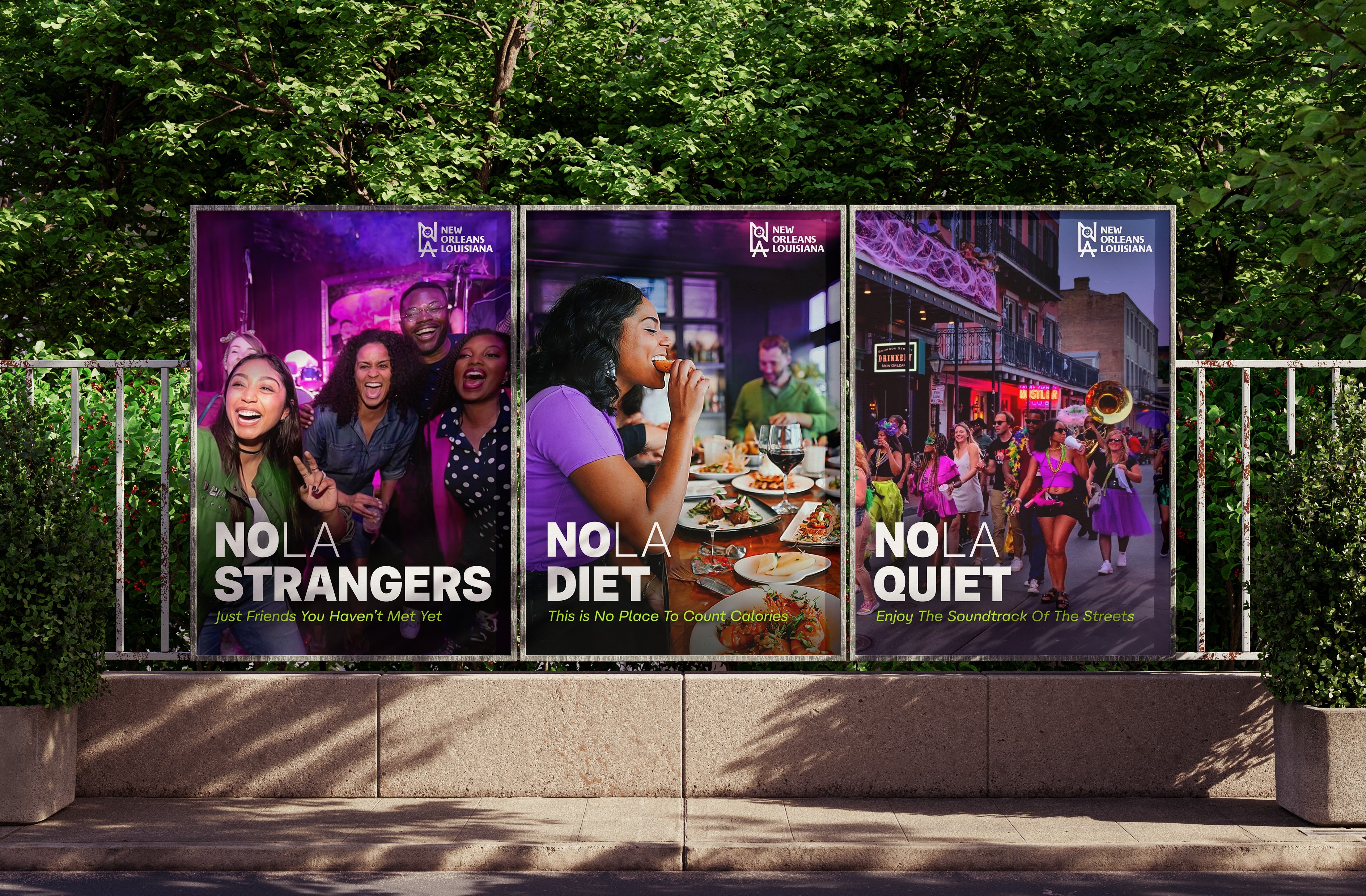
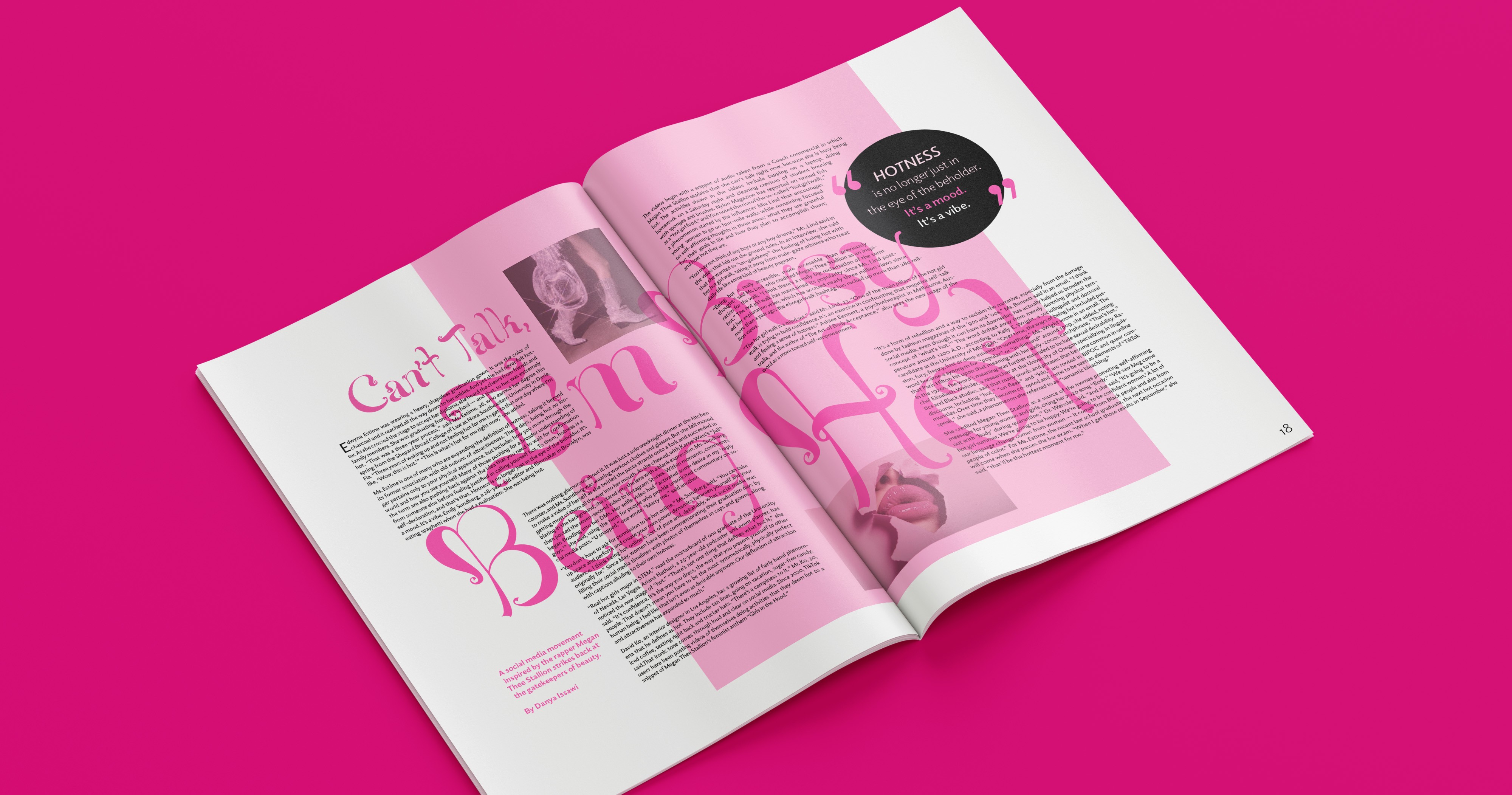
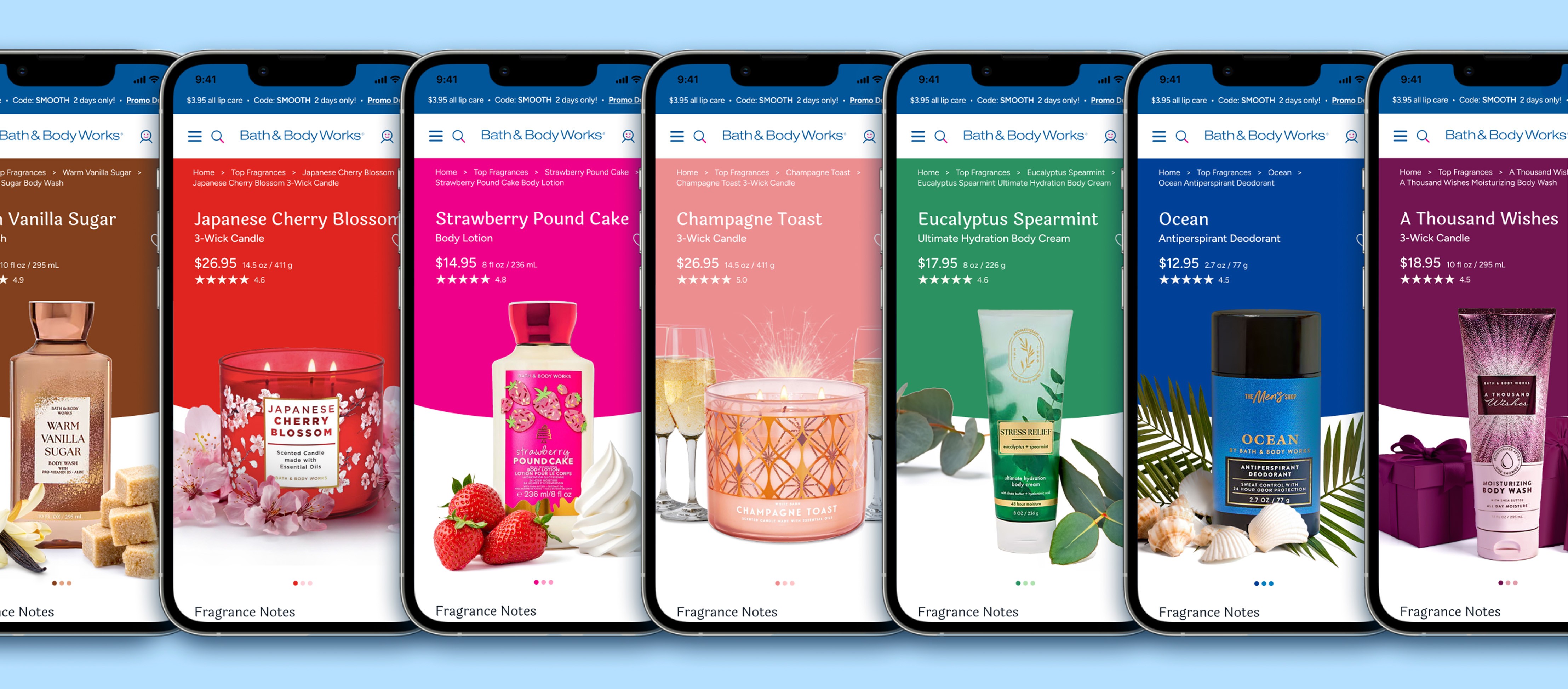
As a brand, EZ-Pass is confusing, frustrating, and a pain in the you-know-what whether you have an account or not. Discounts and ease of access while driving are overshadowed by surprise fees, a complicated online experience, and cold messaging. In addition to simplifying the name to EZpass, this rebrand aims to reposition the brand as a positive addition to your commute, not an ominous source of bills.

Problem
The EZ-Pass brand lacks an organized identity system across its 19 states. It is disconnected, cold, and not conducive to a positive customer experience.
Solution
A rebrand that simplifies the name, unifies the 19 separate identities, and positions EZpass is your essential road companion that takes you where you want to go.
Brand Purpose
To enable seamless travel for drivers across the US
Why?
Without a unified tolling system, tolling is inconsistent across states, leading to confusion, missed payments, and unnecessary traffic at toll facilities.
Target Audience
While most daily commuters have an EZpass tag, the majority of people driving on toll roads are occasional travelers without tags. This group includes people traveling for errands, social events, and leisure activities. Both cohorts prioritize practicality, ease of use, and efficiency.
Archetype
EZpass is for everyone. This rebrand focuses on ease of use and approachability while inspiring travel and exploration.
Old Logo

New Logo
Logo Refresh
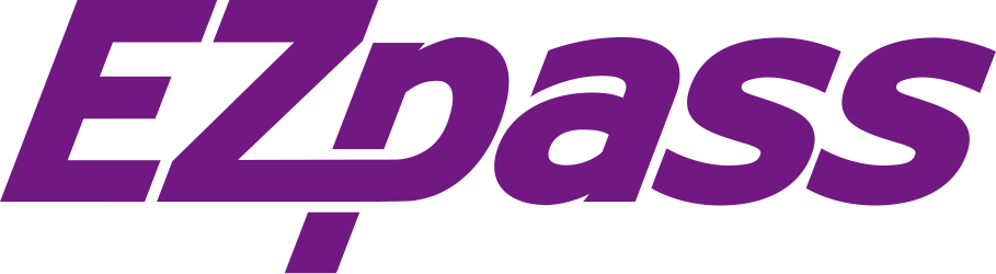
The new logo design maintains the movement of a slanted wordmark while increasing simplicity and readability. Changing the name from EZ-Pass to EZpass and adding space between the letters makes it more approachable and creates an adaptable base for subbrands.
Brand Architecture



















Brand Colors
Using Pantone 259C as a reference point, Parkway Plum is the most dominant color, so that purple toll signs are still associated with the brand.
#721883
#ffffff
#08095C




Typography
Fact VF is a modern sans-serif typeface designed in 2019 by Alexandra Korolkova and Manvel Shmavonyan for Paratype to resemble Frutiger, a 1976 Adrian Frutiger design for airport signage. Frutiger was designed for maximum legibility at a glance. Fact VF is a modernized, friendlier approach, perfect for both huge billboards and phone screens.


My Role
Brand Design
Team
Kinshasa Wilson
Duration
4 months
Tools
Figma, Adobe Illustrator,
Adobe Photoshop,
Adobe After Effects